Saturday, August 12, 2023

No new PAD to show, just checking in

 I just want to see if my old blogger theme, and the ability to change the layout, will restore themselves if I publish a new post...

Well - no... darn...

Sunday, November 21, 2010

Lukie - in progress

This is Lukie, another Belgian shepherd. This, like Shilo's portrait, is 8" x 10", oil on masonite. The photo of the painting is rather Q&D (quick & dirty), so the yellowed newsprint the painting is sitting on shows around the edges, and you can see that the painting isn't properly squared in the photo. I didn't want to crop it, as I want the full painting showing.

This started out with a wild and fun underpainting in vivid blue and orange, lavender for the couch and green for the rug, cushion and wall. Lukie's bandana, which in reality is blue - and which will be blue when the painting is finished - has been underpainted in lavender as well. I enjoyed alluding to the floral print on the couch, in a vague and juicy impressionistic way.

Shilo's Portrait: Improved & Finished

I did some more work on Shilo's eyes, and on his right ear (left side, in the painting). This necessitated working the rock and the tree trunk in the background, a bit. I also darkened Shilo's back end; in the photo it was gleaming in the sun, but in the painting it needed to be darker in order for his coat to look black.

I think that'll do it.

SOLD

Thursday, October 28, 2010

Portrait of Shilo


A new portrait - this is Shilo, a Belgian shepherd. This is 8" x 10", oil on masonite.

Saturday, April 18, 2009

Path for Kaiya


Path for Kaiya, 2009

I wrote this post, oh, back in April - 2009!!! And forgot it was waiting for me to publish it - oy, vey.

Watercolor on Strathmore textured paper, 2 1/2" x 3 1/2"

Wind blowing, mushroomy things, a roller-coaster feel - or more likely just one of those bumpy slides at a playground; rocking waves on a pond; and maybe a birthday party, bright with ribbons and balloons; these are things that might be evoked here. This is for my granddaughter Kaiya, who just turned 5 and is an Aries - the best! (The fact that I said that is how you know I'm an Aries too. It doesn't prove Aries are the best - but it definitely points to Aries thinking they're the best. I do.)

What else can I say about it? There it is. This is one of my favorites.

P.S.: you can see the texture of the textured paper here.

SOLD

Labels: , , , ,


Tender Tree, 2009

Another one I wrote, and forgot to publish, from April 2009.

Watercolor on illustration board, 2 1/2" x 3 1/2"

I think I'm having just about as much trouble writing about this, as with coming up with a name I like for it. I see this as being about energy, the invisible aliveness all around us - in the air, in the ground, shimmering in leaves and grass... Embracing, caressing, touching, connecting; I think of all these things when I look at this. I feel a bit shy writing about this. But there it is - maybe.

If anyone has ideas for a title that might be better, I'd love to hear them. Feel free to include them with Comments.

SOLD

Friday, April 10, 2009

Deep Journey


Deep Journey, 2009

Watercolor on bristol stock, 2 1/2" x 3 1/2"

Okay - this is one I don't like. So, I bet you're wondering why I post it - why don't I just add it to my collage supplies? Well, I think that sometimes some of my most interesting paintings are the ones I don't like. And sometimes I have to push myself way out of my comfort zone to get something I don't like; then again, sometimes they develop that way all on their own.

Once when I gave a slide show talk to a Women Painters West meeting, I included a piece that I just hated. I said just that, as the slide came up. Afterwards several women told me they liked this painting. I was pleased about that; glad I had included it in my slides, glad to have acknowledged my antipathy for it, and glad it had found some friends and supporters.

The fact that they liked it, where I didn't, strengthened a suspicion I already had: that there was something powerful about it that bothered me. I still don't like it, but I do respect it.

Among several other people who like this one quite a lot is my mother. I find this very interesting, even surprising. I would expect her to dislike any risky, unconventional, unsettling painting more than I do, not less. But my mother is sometimes surprising.

What bothers me about this painting? First, a combination of colors I'd call ugly and muddy (the upper ceiling area) with colors that seem insipidly sweet (the aqua and rose), and no good connection, rationale or reconciliation for why these are here together, to my thinking. Second, some awkward shapes and marks.

Most of all, though, I get a very anxious feeling when I look at this, the stomach-dropping sense of being about to be swept into freefall. It looks and feels to me like an underground journey, full of unknown and strange things not yet seen, and some way-too-open space that's beyond the curtain and the narrow gap between ceiling and water. And that curve of the water - I can't help being sent sliding down it; there's no landing spot, and nothing to grab onto. All in all, this arouses a collection of primordial fears: fear of dark places and creepy things, fear of closed spaces, fear of open spaces, fear of falling....

All in all, I get the feeling that this one is effective and rather powerful. I suspect this underground journey could be a valuable one. But I still don't like it.

I hope you enjoy reading about my response and my process, and I'd love to hear about yours. Any comments are welcome - as you might guess, you won't hurt my feelings if you say you don't like it, and I'll respect you no less if you do like it. I'd love to hear your thoughts.

Available

Email me if you'd like to buy this painting.

Labels: , , , ,

Thursday, April 9, 2009

Bouquet Notes


Bouquet Notes, 2008

Watercolor on watercolor stock, 2 1/2" x 3 1/2"

I'm not sure what to call this. I don't want it to sound like a straightforward floral painting, much as I admire realistic paintings of flowers. I find them simply gorgeous, when well done. But this, on the other hand, has calligraphic bits almost like little ideograms, or pieces of ideograms; and the flow of it almost begins to create a little world, or landscape, that you could wander around in, picking up pebbles and twigs.

For quite a while, as I was working on this, it felt too jangly and fragmented, and I wasn't happy with it. It seemed to divide itself, persistently, into four quadrants that weren't joining and talking to each other. Finally some marks I made (I think it was the dark bits in the Vee, and below that, and within the rose-colored sort of flower, that did it) brought it together and made sense of it.

When I call it Bouquet Notes, I mean "notes" both as in "notes for a painting of a bouquet," which can be written notes, words or letters, or sketched notes and marks; and as in "musical notes related to a painting of a bouquet." Or something.

I love marks. One of the reasons I love writing is not just to communicate thoughts, or even for the sound of words together, but also, simply, for the sake of seeing lines of little letters marching across paper like strings of ants. I feel rich when I accumulate quantities of these little marks; it's as if each one were worth a penny, and I have so many that lots and lots of money is coming to me all the time. I know this isn't true, but some part of me remains completely convinced of it.

SOLD

Labels: , , , ,

Friday, March 13, 2009

Curtained Nest


Curtained Nest, 2009

Watercolor on watercolor stock, 2 1/2" x 3 1/2"

I'm often torn about whether to give names to these, or not. I could call all of them, or many of them, Untitled. But I love giving them titles.

At the same time as I love the naming, though, I don't want to lead a viewer strongly in a particular direction, a particular way of seeing a piece, when that person could be seeing it with fresh eyes, seeing things that I didn't see in it. I hope, if you see cliffs, or forests, or underground streams, or - who knows? - planets in deep, dark outer space, that you'll stick with your way of seeing this.

This is one of my favorites, somehow. It started out seeming rather unpromising, to me - rather impoverished colors; one shape I liked quite a bit with a bunch of boring parallel lines, and a couple of indifferent areas of color; some directional shapes and spaces that didn't seem to go anywhere. I still liked it, but couldn't see where it should go to come alive. I think the journey this one took shows the value in continuing when you can't see the road ahead - now I love it.

For me, it has a kind of sweetness, while still feeling light - the delicate taste of maple sap before it's been boiled down to maple syrup, rather than the thicker, warmer sweetness of honey. And along with its warmth, there's a cool, breezy feeling about it.

SOLD

Labels: , , ,

Thursday, March 12, 2009

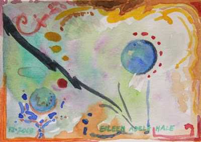
Black Lightning

Black Lightning, miniature watercolor, black lightning bolt dancing with swirls and bubbles
Black Lightning, 2008

Watercolor on bristol stock, 2 1/2" x 3 1/2"

Now this one has more of that edgy energy, tangles and collisions, and elements dancing with each other. Earth colors framing a watery space, and that jagged black lightning bolt springing in from the left, and some bubbles peering at it.

SOLD

Labels: , , ,